4.1 Approaches for analysing newspaper collection
4.1.1 Reading the corpus
For the following examples, we will use a dataset of newspaper articles in English that we extracted using keywords related to the Spanish flu. The Spanish flu spread in waves between 1918 and 1919 (a little over a year). It is estimated to have infected approximately 500 million people worldwide and caused the death of around 50 million individuals. The media coverage of this event is a complex subject. Indeed, during the same period, it intertwined with the events of World War I, especially during the first wave of the epidemic in 1918.
You can apply the following examples to other datasets extracted from the NewsEye platform (see Unit 2).
Download the dataset you can find here. It is in CSV format; save it in a folder accessible from your Jupyter Notebook environment.
We will need some libraries installed in our Jupyter Notebook environment to read our corpus.
!pip install gensim PyLDAvis spacy pandas regex nltk matplotlib numpy wordcloud
!python -m spacy download en_core_web_sm
Then, import the required libraries. As you can see, we will need language processing, text, and visualization libraries.
#languange processing imports
import gensim, spacy, logging, warnings
import matplotlib.pyplot as plt
import nltk
from nltk.corpus import stopwords
import sys
import re, numpy as np, pandas as pd
from pprint import pprint
from nltk.stem.porter import PorterStemmer
from gensim.utils import simple_preprocess

#For the text overview
from nltk import FreqDist

#Word Cloud and Visualization

from wordcloud import WordCloud, STOPWORDS
from sklearn.feature_extraction.text import CountVectorizer
import matplotlib.ticker as mtick
import matplotlib.pyplot as plt
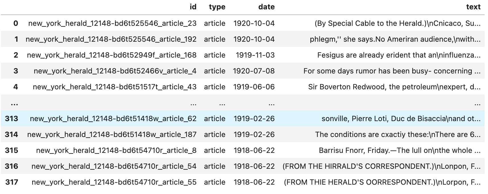
Let's start by visualizing our data as a table and checking that it reads correctly. Create a new data frame from your collection using Pandas. The Pandas library is not mandatory but useful for quickly visualizing and manipulating data, such as adding fields or filtering data.
df = pd.read_csv('../data/spanish_flu_csv.csv', encoding='utf-8')
df
You should see a table in the following form, which tells you that your data has been correctly read:
At this stage, we only have information that our dataset contains texts and lacks further details. Therefore, preliminary statistical analysis based on the document type can provide valuable insights. As an illustration, we may notice that our texts have varying publication years, which enables us to create a graph illustrating the distribution of the texts per year. This representation can provide crucial indications about the characteristics of our corpus, such as potential temporal trends, topics, or language use patterns.
# If year column is not available in your dataset, you can generate it whit pandas
df['year'] = pd.DatetimeIndex(df['date']).year
df.head()
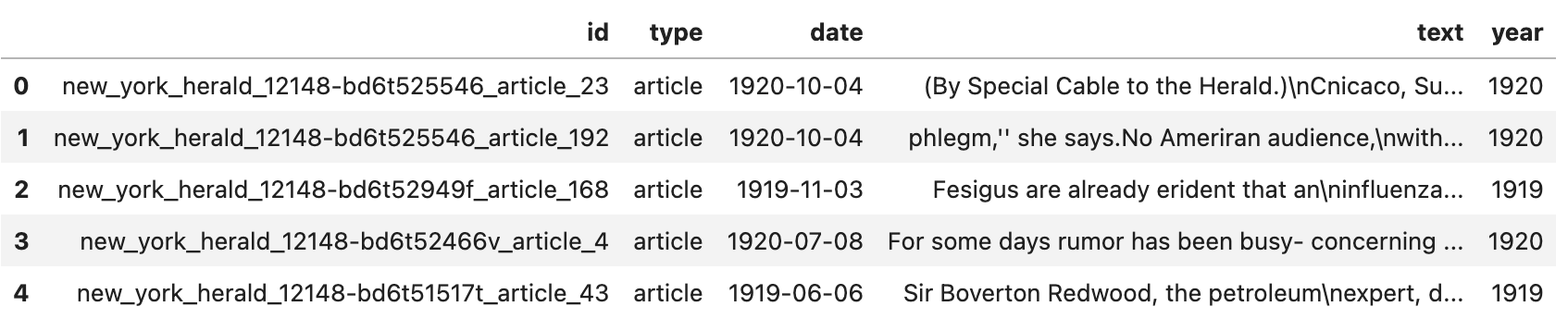
As you can see, we now have a column indicating the year the article was published. We can now plot the number of articles per year.
fig = plt.figure(figsize=(20,50))
fig = df.groupby('year')['type'].value_counts().unstack().plot.bar(stacked=True)
plt.savefig('bar.png', dpi = 300)
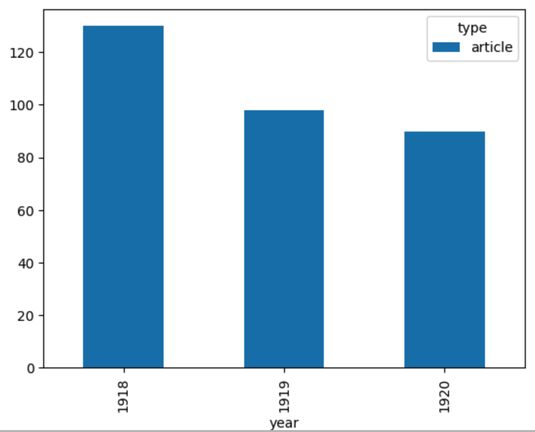
In this lesson, we read data in CSV format, display its contents with Python and graph a simple statistic. Depending on the content of your dataset, many other things can be done. We could, for example, display the proportion of each newspaper title, study the length of the articles, etc... However, to go further, we will now need to analyze the text and experiment with the methods we have seen before.
REFERENCES
- Spinney, L. (2017). Pale rider: The Spanish flu of 1918 and how it changed the world. PublicAffairs.